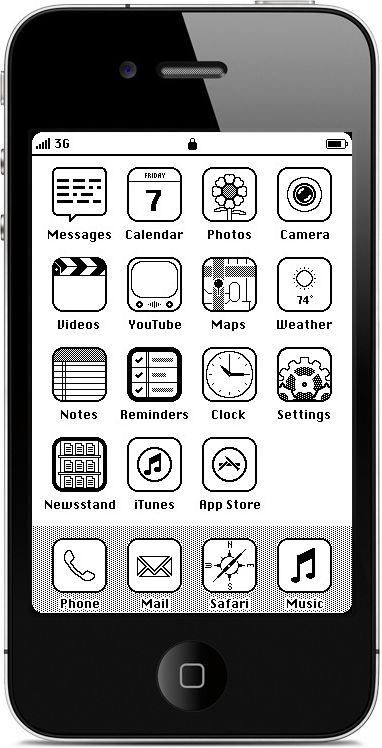
iOS '86.0.1
Have you seen iOS '86? The idea behind it: what would happen if designers from the Macintosh System Software team in 1986 were to get their hands on a (somehow monochrome) iPhone 4S? It's a pretty neat idea, but I disagree with Anton on a few details. On the original Macintosh desktop, there are rounded rectangles in every corner to make the screen look less sharp and more friendly. Also, I don't think the Springboard bar would have a 3d effect, so I made it into a more contemporary shaded rectangle. I also disagree with the chosen icon weight: Susan Kare overwhelmingly chose to use white icons with black features, and inverting this pattern represented a selected item. In iOS '86, therefore, apps should appear mostly white until clicked.
